This week I completed my reformat of The Legendary Inge and officially transferred it over to Eulalia Skye. The revamped edition is now live on Amazon in both print and eBook!
Feast your eyes on this beautiful cover!

What’s new in this edition?
- The cover! (obviously, haha)
- Gone are the monochrome cartoon-style illustrations. The gray/blue color palette echoes the original’s cool tones, but with a more refined effect. (See further details below.)
- An interior bleed!
- The same ornament that graces the top corner of the cover repeats on pages within the print book: the title page, chapter headers, and front/back matter sections. This was my first time working with a bleed, and I love the result. It’s SO fancy.
- Discussion Questions!
- Handy for book clubs or other pondering purposes. Idk, guys. I wrote these up for a book club meeting a few years back, and I still had them. So, I tossed them in for funsies. You’re welcome.
- eBook only: Links to my newsletter signup and my Facebook Page.
- Oh, hey, I have a newsletter mailing list now (*cough* shameless plug *cough*):
The form you have selected does not exist.
- Oh, hey, I have a newsletter mailing list now (*cough* shameless plug *cough*):

FYI, if you’re new to this book and on the fence about whether to get it, the eBook will be $0.99 from July 3 – 5. I don’t do sales all that often, so take advantage.
Previous Readers
If you previously purchased The Legendary Inge as an eBook, you have the option of updating your copy in the “Manage Your Content and Devices” page of your Amazon account. Amazon deemed this a minor quality update, so will not be notifying previous readers. Consider yourselves notified here.
Bear in mind that, due to the new formatting, the kindle locations have changed within the interior file. So, if you marked any passages in the old version, they might map to the wrong section in the update.
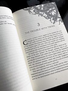
(I don’t know how, but Vellum apparently condenses the locations. Maybe it has more efficient coding or something. I only deleted like two words in my typesetter’s edit, so the book contents itself is basically identical to the original, minus a few embarrassing typos.)
And now for something completely different.
The Legendary Inge: A New Cover
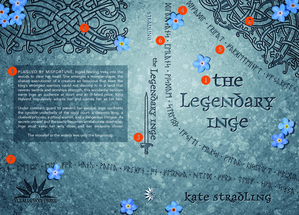
My original cover took its inspiration from the Franks Casket, one of my favorite relics of the ancient world. In planning this reboot, I looked to a different style of Nordic relic: runestones. These monuments dot the Scandinavian lands, patterned with Viking carvings and winding runic text.
With that inspiration in mind, here’s the breakdown of elements in this revamped book-skin.
The Breakdown
- Fonts:
- Primary: Frances Uncial. I think what sold me is how much the letter <d> looks like an eth <ð>. I love the stabby serifs and the inconsistency between upper and lowercase letters.
- Secondary: Avenir Book and Junicode. Avenir is a lovely, no-nonsense sans serif, and its Book style has a nice, light weight to it. Junicode was non-negotiable (see items 5 – 7).
- Ringerike style ornaments. These come from designer Jonas Lau Markesson, who has some absolutely gorgeous Viking vector art. At only $15 for a commercial license, they were worth every penny. The ornament on the front also repeats on Chapter Headers within the print edition.
- Sword ornament: the crossbar of the hilt comes from a second set of Markesson ornaments. It’s also Ringerike style, but I had to add my own handle and blade to complete this. I love how the end product turned out. The book spine was the only place it could go without cluttering the aesthetic, but it fits well there.
- Forget-me-nots. I had to do it. That’s my favorite dagger in the book, and I think it represents my heroine well.
- Runic Text A lists some of Torvald Geirson’s smaller blades. From the top: Daffodil, Cricket, Forget-me-not, and Firefly.
- Runic Text B names some of the Virtue Swords: Diligence, Patience, Wisdom, Strength, Loyalty, Mercy, Valor, Respect, and Obedience (cut off at the margin). There were a couple more beyond the top of the book, but I wanted the most important centered in the line.
- Runic Text C is a transliteration of Beowulf 947-949a, the inspiration for this (ig)noble book.
Fun with Futhorc
“Oh, hey,” you might say. “Those runes are pretty awesome.”
And you’d be completely right. The runic alphabet (aka Futhorc, so named for its first 6 phonetic sounds) served as the writing system for Germanic and Scandinavian languages 1200 – 1800 years ago. Its design, primarily straight lines, makes for easy carving into hard surfaces.
If you want to play with futhorc runes, look no further than futhorc.com. This site makes phonetic transliterations from modern English words. It’s a lovely tool for all your runic needs. You must have the Junicode font if you want to use those transliterations digitally anywhere else, but that’s a free download and an extremely useful addition to any font inventory.
I used futhorc.com to verify the weapon names. I had to do the Old English lines of Beowulf myself, but I got to use stan and ear, so I have no complaints. (Stan reportedly has only one real-world attestation, and ear apparently belongs to Hel. So metal.) Anyway, not sure why I’m so obsessed with runes, but I jump at any chance to use them, so.
In Summary
- The Legendary Inge is now part of the Eulalia Skye crowd
- The eBook will be $0.99 from July 3 – 5
- Previous eBook buyers can update their old version to the new one
- Futhorc is fun to play with
It’s GORGEOUS and so is the inside!
Thank you!! Somehow, miraculously, everything came together the way I pictured it in my head. 😀
I think I’ll have trouble deciding whether to update the cover or not. I love the old one, but this one is so pretty too!
Okay, you get extra points. The old cover was my first foray into Adobe Illustrator, so it represents a huge gap between what I intended and what I could actually produce. I’m always so grateful when someone says they liked it.
Awesome! I love it. Also been watching Vikings for the first time so this feels appropriate. 😀
The universe aligns!
Comments are closed.