So in my pursuit of a productive year, I set myself some project deadlines and homed in on the first of the bunch. I’m happy to report that Goldmayne: A Fairy Tale has transferred over to my imprint. The updated ebook and paperback are both available.
The book received what I’m calling a typesetter’s edit. I.e., if a line or paragraph didn’t space itself well on the page I took the liberty of deleting a conversational tag or adverb. Sorry, not sorry. (There’s also a single line of dialogue that changed, primarily because it introduced a secondary context that wasn’t appropriate for the character speaking it, but I digress.)
Product Details, Ooh La La
Paperback
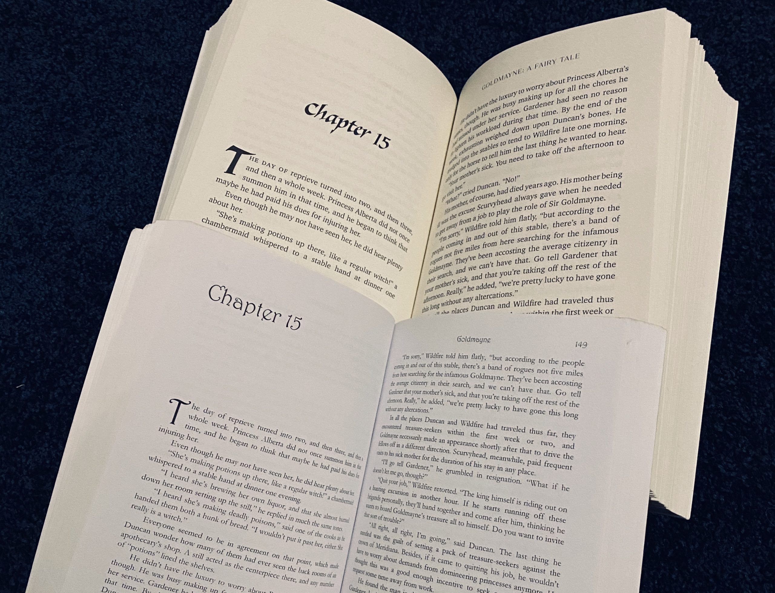
The paperback interior is a VAST improvement over its earlier incarnation, if only in ease of readability. Typesetting guidelines put a boundary of 10 – 12 points for main body text. The old Goldmayne was in 10-point Garamond, because the book is ~122K words long. (My longest published work. Surprised?) Technically, that typeset met the prescribed boundaries, but the text was tiny, and I didn’t know at the time that Not All Garamonds Are Created Equal.
The new typeset is in 11-point Charter, with no hazards of eyestrain to be seen. It is lovely. It is also roughly a hundred pages longer, even though the text is about a thousand words shorter. (A prime example for why word count is the most accurate measure for the length of a book; page count is variable, depending on the set.)
Ebook
The ebook got a reformat in Vellum, for a nicer, cleaner file. It just looks more professional all around.
And some extra good news? For this update, I kept track of any actual “quality” corrections I came across. The missing word in Chapter 16. An incorrect homophone in Chapter 2 (!). A couple of misspellings and some inconsistent usage (drily vs. dryly, for example). I finally gave up on “intransience” and replaced it with “permanence,” and I made a universal correction of “honed in on” to “homed in on.”
Which, to be fair, I’m still a little salty about. More on that below.
Long story short (too late), after I republished, I sent that list of quality changes to Amazon, and they have deemed this a “major update.” Meaning, if you previously bought this ebook, you should be getting an email that there’s a new version available. Whether you get the email or not, you can access the update in the Manage Content and Devices section of your Amazon account, if you so desire to have it.
Two notes:
- If you want to keep the old cover, don’t update the book. I have mixed feelings about the new cover, but it’s one of those things where I’m going to shrug and move forward.
- If you have highlighted passages you want to keep, maybe jot down their context on a notepad before updating. Kindle locations changed in the new formatting, so the whisper sync feature might map them to the wrong text section. (Idk, I never highlight in ebooks, so it’s not something I can check in my own copy of the file.)
And now, a usage aside.
Honed in on vs. Homed in on
In my ten years of publishing, no one has ever called me out for using “honed” where it was supposed to be “homed.” I am, quite frankly, shocked and disappointed in all of you.
No, no. I joke.
I discovered this usage argument a couple years back and was dismayed more than I can here express. The prescriptive rule states that “home in on” is correct and “hone in on” is an erroneous usage that has wormed its way into vernacular speech. “‘Hone’ refers to sharpening things! It has nothing to do with visual focus!” quoth the naysayers.
But here’s the thing.
My brain had a marked semantic difference between the pair of phrases. For my idiosyncratic usage “honed in on” denoted a sharpening of focus from across a distance, like a camera lens zooming in on its subject from afar. “Homed in on” implied movement toward that subject, like a homing missile closing in on its target. Basically, I had learned the “wrong” phrase as a separate semantic unit.
You guys, I get called out on the silliest things. Like, there are readers, bless their hearts, who delight in finding any little error they can (or perceived error, because they’re not always right, lol). This one would have been easy pickings. WHY HAS NO ONE EVER HOMED IN ON IT?
(Haha. I couldn’t resist.)
Anyway, after reflecting on the misalignment between my internal lexicon and the mainstream prescriptivism, this is an instance where I decided to capitulate. I have duly retrained my brain to save “hone” for sharpening tools or wits or talents, because it’s a good word and I don’t want it dragged through the mud any more than it already has been.
Thus, I’ve edited its misuse out of Goldmayne and the first two Annals of Altair. It’s still in the Ruses books and The Legendary Inge. (I mean, maybe. I haven’t actually checked, but I liked the phrase, so I’m assuming I used it on the regular.) Timeline-wise, I think I discovered the discrepancy during my drafting of Namesake, but if anyone comes across it there, feel free to snark about it. We can both have a good laugh.
Final Non-related Addendum
For the time being, I’ve set my whole website to shut off comment sections after 14 days. Too many Russian bots were bypassing my discussion filters, and I got tired of cleaning them out of my moderation queue. I’ll revisit this in a few months, but for now, if you want to comment, strike while the iron is hot.
(Unless you’re a bot, in which case, kindly take your shady pharmacy links elsewhere, please and thank you. Why you gotta ruin everything for everyone else, huh?)
I am not a fan of the new cover myself, or chapter header font, but the fact it has a physical copy is great. I now have an actual physical book to shove at people when I tell them they should read it!
I am going to be careful about updating my kindle copy though, at least until I have a chance to read the updated version. I am always wary of revisions to books I like, since you can’t exactly go back.
Yep, once you update, it’s a done deal. Luckily, that’s an opt-in situation. From my perspective, the changes to the text were minimal, but I don’t know what a side-by-side comparison would reveal, or whether individual readers would care about the differences. I think your approach is wise.
As for the cover, I had issues with the old one as well, so this is kind of a mixed bag for me. The old title/header font was Harrington, which is a system font that can be found all over the place and is expressly looked down upon for professional projects. I really love the new font (Wolftrack STD), but I also have an affinity for calligraphic scripts, so that’s my own bias at play.
Comments are closed.