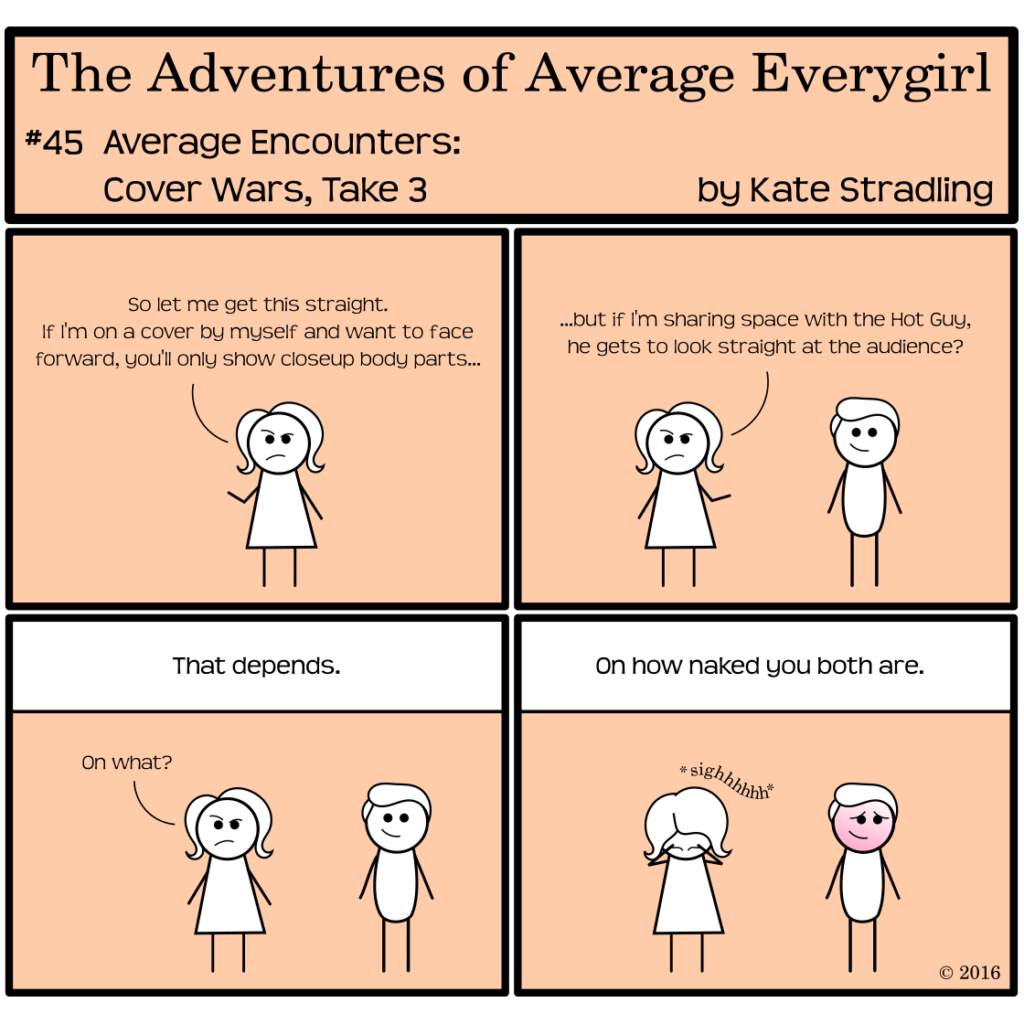
Every cover sends a message, but the message intended and the message received can differ drastically. It’s the reason authors and publishers field-test their images before making a final decision. According to the Market itself, covers should have only one message: “Hey. Buy me.”
Seductive, no?
The prospective reader doesn’t receive the message in quite such succinct terms, of course. The well-crafted cover lays out its arguments more artfully:
“Don’t you love my color scheme? I see it caught your eye from across the room. My image, too, intrigues you. Go on. Pick me up. Run your fingers down my spine. Read my summary. Take me home with you and we can snuggle up together in a comfy chair for the whole evening and into the night.”
And suddenly you find yourself at the book store’s register with a hundred dollars worth of merchandise cooing at you from a plastic sack while the clerk runs your credit card and silently judges your choice of literature.
(I may or may not be speaking from personal experience.)
When the message gets lost in transmission
As powerful an impact as a book cover can have, though, the more often a particular style of cover appears, the more diluted its message becomes. The perfect color scheme gets drowned out amid thirty books sporting the same palette. Images recycled or cloned to market off the success of their forerunners might come off as desperate or canned instead. Even the artistic word-art covers so trendy right now are beginning to bleed together on the book shelves.
Some styles become so iconic of a genre that any variation is almost sacrilege. Bodice-rippers feature a beefy hero embracing his scantily-clad heroine. Regencies display a demure woman with or without her gentleman suitor. Mysteries and thrillers lean toward word art with simple motifs: silhouettes, or gunshot holes, or a story-specific object highlighted (in a pool of blood, often).
Even so, variation within the constraints of these themes is welcomed and desired. (Though perhaps not so much with bodice-rippers. I’m not sure that audience uses much of a discerning eye when it comes to covers. I’m positive the publishers don’t expect them to.) Even simple details such as typeface and title placement can mark the difference between tired-sad-overdone and crisp-vibrant-exciting.
Every variable must work in harmony to convey that all-important message.
“Hey. Buy me.”
Because, you see, that sale is the ultimate goal. The cover doesn’t care whether you actually read the book at all.