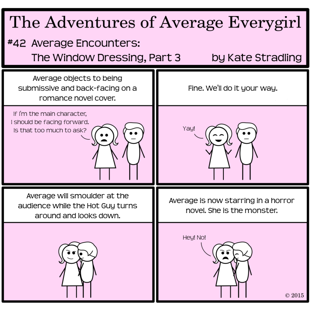
Every genre has its aesthetic. Book covers act not only as visual cues for the characters and story within, but they can also preview the mood of the narrative. Women on book covers, in particular, set pretty specific expectations.
A woman smoldering in the arms of a submissive, attractive man lands the book in the realms of horror or erotica. If she’s wide-eyed, she’s the victim in a thriller. A powerful stance indicates dystopia or adventure, particularly if she’s also holding a weapon and surrounded by a lot of light flares. Classical literature leans toward classical paintings. Modern literature tends more toward word art rather than pictures. (The lack of a woman on a cover communicates expectations too, in other words.)
The power of aesthetics
The patterns inherent to each genre serve as a strength or a stumbling block. Art is more than just buzzwords and trendy aesthetics, and if the cover design fails to reach beyond these points, it can fall miserably flat. One of the dangers of pre-fab covers is that, because they’re formatted without any source material in mind, they can lack the extra ambiance that makes a great cover special. Generic art does no one any favors.
But that’s not to say the ambiance can’t be tweaked into place.
One of my favorite features to look for on book covers is the color palette. (I bet you thought I was going to say “the hot, shirtless guy” instead, right? Haha.)
Just as the color of walls in a room affect our moods, so also do the colors on a book cover. A well-blended palette brings me joy. Mismatched tones create internal discord. Monochrome can be comforting, powerful, or just plain boring. Busy patterns can spark interest or translate to visual static on the brain.
Perfect color palettes are a thing of beauty.
Or maybe I’ve spent far too many hours of my life playing Blendoku.
(There’s really no “maybe” on that. It’s flippin’ addictive.)
The Whole Package, topped with a neat little bow
When the book-cover stars align—perfect image, perfect font and word placement, perfect color palette—the result can be breathtaking.
Every author wants to wrap their masterpiece in pretty paper. Still, all the sparkly trimmings in the world won’t make a silk purse out of a sow’s ear, as the saying goes. For all of my high talk of aesthetics, for all the market power a cover can bring, in the end it’s only window dressing. Covers may come and covers may go, but the words within endure.
And so, as far as books are concerned, image is not everything after all.
(But it sure is a lovely detail.)