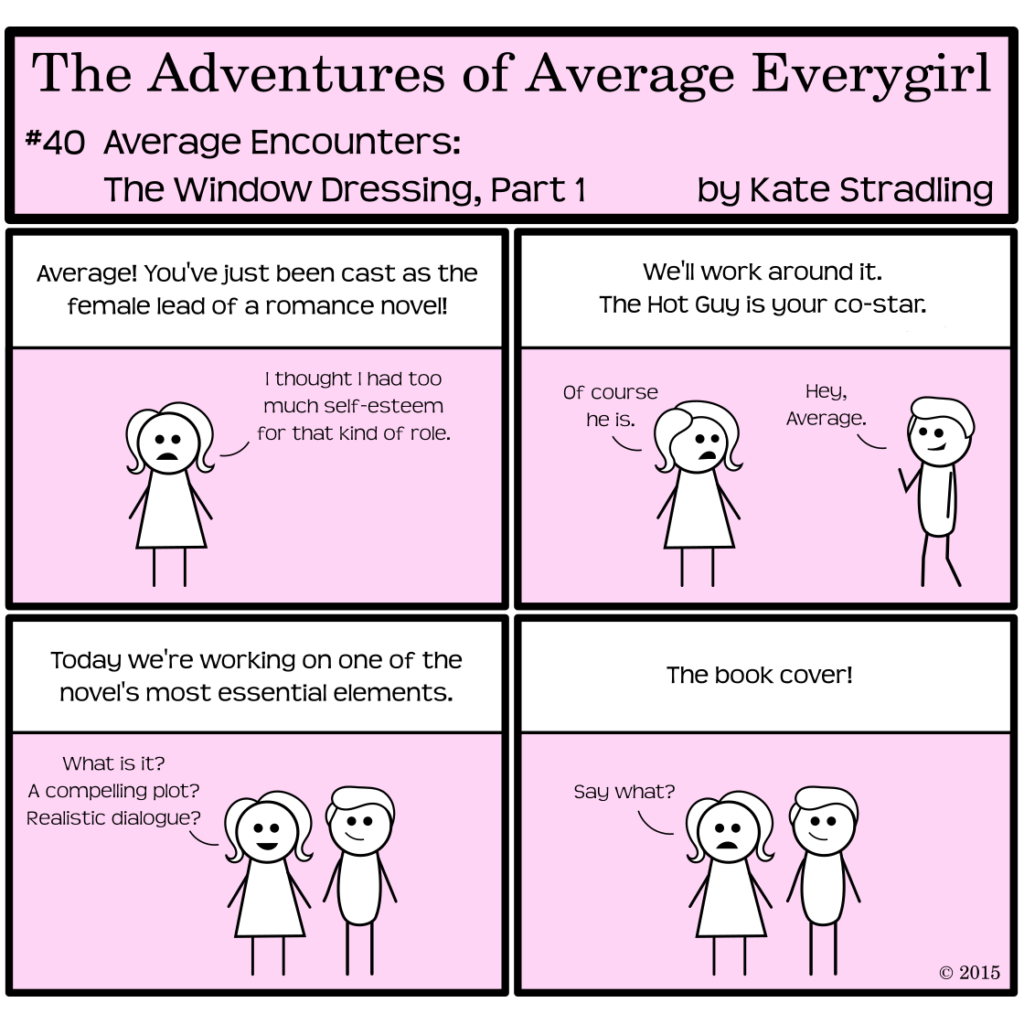
People in glass houses shouldn’t throw stones. I know this. So before I launch into an analysis of book cover trends, I here acknowledge that my own covers qualify for the High School Art Student’s Midterm Project Award, insofar as grading scales are concerned.
Which brings me to another old saying: Don’t judge a book by its cover.
In today’s world, this is rubbish. We all judge books by their covers. In fact, book covers affect sales to such an extent that online services like PickFu offer quick A/B feedback on this very endeavor. Heck, PlayJudgey has made it a game.
Gone are the days of monochrome-canvas-wrapped board with gold-embossed titles. Covers are a work of art unto themselves, and creators wisely use them to their advantage.
(Unless you’re me. I do what I want and reap the consequences.)
Book Cover vs. Story Content
There is a growing trend in writing communities, however, that seems to place more emphasis on the cover than the content within. It’s not just the focus-group inquiries mentioned above. It’s a whole industry of pre-fab covers, where authors can claim the designs they love for books they haven’t even dreamed up yet.
Now, I’m all about finding inspiration in diverse places. The practice of acquiring book covers before a book is even minutely plotted, though, seems about as useful to me as seeing something shiny in a store window and then bringing it home with nowhere to put it.
Admittedly, where pretty things are concerned, “useful” often falls by the wayside. There’s a danger in snapping up that shiny bauble, though: design is a fickle pet. As with any form of art, it changes and transforms over time, its features tied to the era in which they came together. A great cover today might look outdated within a few years, depending on where design trends go.
Peruse any used book store for titles 8 – 15 years old and you’ll see what I mean. It almost makes a girl wish that cover art came with an expiration date as warning: “Best used before 26 Aug 2020” or the like.
Inspiration vs. Creative Rhythms
In my case, the perception I have at the start of my novel draft is so vastly different when I’ve finished. After immersing myself in characters, plot twists, settings, and themes, I look back on my initial perception with that foreign-but-familiar sense of nostalgia: the me at the start knew nothing compared to the me at the end. Creation is an act of growth and change.
But that’s my overly analytical brain at work. The Market doesn’t care about an author’s growth process. It doesn’t even care whether the book is well-written. Slap a pretty cover on that sucker and stick it up for the world to admire. The prettier it is, the more copies you’ll sell.
And therein lies my struggle. My primary ambition is to write a good book.
(Sorry.)
The process is different for other authors, of course. Some have their aesthetics in place from the start and stay true to that vision. Kudos to them. Others find brilliance in the cover and transfer it to words on the page. Again, they have my admiration.
If we really take book covers as a work of art unto themselves, like any work of art, they deserve to stand as tribute and inspiration to creativity. Perhaps they even deserve merit independent of the work they aim to represent. Interesting thought, that.
The book world is full of gorgeous covers. What are some of your favorites?
Book cover art can be nice, but nope, I still think what’s inside the book is more important. I might initially grab a book off the shelf because the book cover art caught my subconscious’s interest, though. Still, I won’t buy it or read it unless there’s something good inside. And I can usually figure that out pretty easily nowadays.
I’ve totally picked up a book because the cover was pretty. Like you, I’m super picky about buying it without checking the contents, though. We may well be in the vast minority on that one, though. (Or maybe people have different definitions of what is “good” when it comes to books. *shrugs*)
Haha, I actually really like the older style books – monochrome with gold trim and no picture. So classic! I typically don’t like people on the cover because I like to imagine what they look like, but I particularly don’t like buying books that have been made into movies with the movie characters on the cover.
I agree. I like simpler covers, and the old-school covers are comforting to me, in a way. Movie-poster covers are my least favorite. I’ve actively gone out of my way to avoid them by buying used.
Comments are closed.