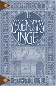
Happy June, everybody! Here’s a new book for you to read!
Click here for the Kindle version!
The print version should show up in a day or two. It has at least 2 typos, found 10 minutes after I clicked the “publish” button. I’m sorry. They never emerged in multiple layers of proofreads, of course, and I’m too done with this hoop-jumping project to correct them now. (They’re corrected in the Kindle version, though, because that was easy to do. So that’s the version I’m going to pimp, hahaha.)
I know, I know. I’m supposed to set up pre-orders and hype a cover reveal and join a blog tour, and half a dozen other marketing strategies. Sorry I’m such a cynic. The honest truth is that I don’t really respond to those efforts from others, so I’d feel like a raging hypocrite implementing them myself. Maybe sometime down the road I’ll ease into that sort of thing. Until then, it’s just me running outside, banging pot lids for five minutes, and then going back in to mind my own business. (That was an analogy. I only really bang pot lids on pre-1995 New Year’s Eves.)
Full disclosure: I have been in a love-hate relationship with this novel ever since its first wisps of inspiration germinated in my brain. I know I’m supposed to tout it like it’s the greatest literary event since Pride & Prejudice hit the shelves in 1813, and my candor here is a complete marketing taboo, but such it is. I do love it, warts and all. It’s a fun story, a fun setting, and a fun cast of characters. I’m not really sure if it’s too far in my comfort zone or too far outside of it. I haven’t ever read another book like it, so that’s probably what’s making me nervous. But I truly, truly hope you enjoy it!
A few words on the cover:
1. Imma be honest. It offends my minimalist sensibilities. I like clean and simple, and I waffled over this cover forever because of that. However,
2. It’s inspired by the Franks Casket, which I adore. In that respect, it really does reflect some minimalist principles (have you seen how crammed those panels are with people?), which makes me like it better.
As an aside, if you want to transliterate an English text into the runic alphabet, futhorc.com has provided a lovely little tool. You’ll need Junicode (the modern linguist’s dearest friend) to use the runes in any projects, but that’s just a matter of downloading a free font, for which they provide a link. And Junicode is awesome in its own right. Everyone should have it installed. (I’ve had it for about a decade. #humblebrag)
3. Blue is probably my favorite color. So that makes me happy.
4. In general, I strongly dislike faces on book covers, especially stock photo faces. With few exceptions, the models never look like the characters in my head, and the cover becomes a disappointing distraction instead of a reason to read the book. There are exceptions! But they belong to other authors. With my visual brain and high expectations, there is no possible way I could ever match my characters to a representative photo, which is why I take the illustration route. Not that I owe anyone an explanation, but I’m just putting the information out there. Transparency, you know.
Also, go to a stock photo site and search for “Viking girl” or “Viking woman.” Yeah. Haha. You’ll find about 12-15 kinds of ridiculousness, and much of it scantily clad, as though it’s not routinely -112° in that part of the world.
That’s all the procedural matters for now, I think. Happy Reading, you beautiful people!

Hooray! I banged pots and pans for five minutes, too. 🙂
Together, banging pots and pans across the intervening miles. Thanks for the solidarity! 😀
Okay, if there’s pot bashing going on, I want in.
Oh, you’re in. Grab a lid and clang to your heart’s content.
I completely agree with #4. It’s especially disturbing when they use a face photo on the second printing after using charming art on the first. For example, Goose Girl, by Shannon Hale: http://ecx.images-amazon.com/images/I/51zrIW98MFL._SX317_BO1,204,203,200_.jpg
and http://ecx.images-amazon.com/images/I/51fqNBij7iL._SX326_BO1,204,203,200_.jpg
Oh, that just made me sad. The first cover was basically perfect. The second cover reminds me of the “movie poster cover” book editions that get released and ruin everything. (I mean, they don’t *really* ruin the text of the book, but I refuse to buy them anyway because of the imagination-taint they accomplish.)
Sorry for making you sad!
No worries. I’m resilient 😀
Comments are closed.