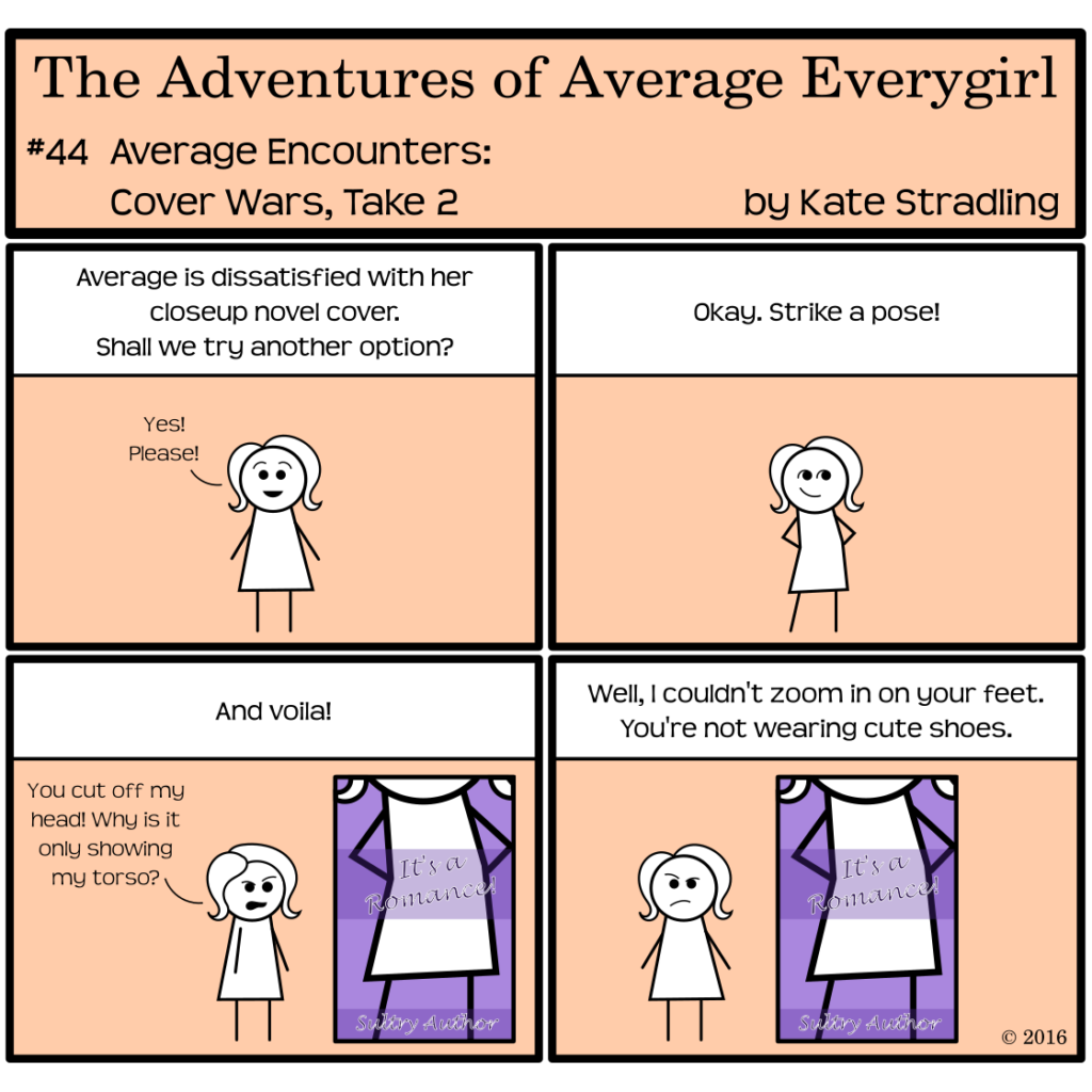
As far as I’m concerned, the torso-only cover image serves two purposes. First, it absolves the designer from matching the model’s identifying features to any descriptors within the book. This can be a plus, as some readers (*coughyourstrulycoughcough*) don’t like their mental imagery of characters to get muddled up by a photograph or illustration. The torso approach, along with the cute-feet-in-cute-shoes variation, can set the tone of the book while leaving the reader free to imagine faces as they please.
This approach highlights extravagant clothing and accessories. It can invoke a sense of mystery and intrigue, depending on the pose, the lighting, the color palette, etc. “Who is this attractive person? If only you could see their face! Read within to learn more!”
Because, let’s be honest, these types of covers never have “unattractive” body types on them.
Which brings us to the second purpose: the torso cover objectifies.
It’s Person-as-Object in visual form.
Often, there’s no character representation on that cover. It’s not even really a model. It’s just a body, a physical object displayed for your ogling pleasure. There’s no human expression, no depth of soul conveyed in this type of imagery. It’s a piece of meat. You might as well put a horse flank in its place.
And, in this instance, the men get shorter shrift. A faceless female model acts as an avatar for the reader: “Step into this body and experience her life!” Rarely does the torso-only man on a cover fill that role. Instead, shirtless chests and six-pack abs advertise salacious details within. You can’t see the guy’s face? So what? He’s an object, the promise of a story that will titillate and arouse. He doesn’t need a face.
And you certainly don’t need to see it.
Because, to this cover, you’re an object too. The reader is an animal acting on primal instinct, forking out money for that promise of fleeting sensual fulfillment.
Kind of depressing when it’s put in those terms.
Reforming the torso trend
Picture, though, this style of cover used with non-idealistic body types: a fat man in a wife-beater; a granny in her nightgown; a war-torn amputee. Picture the cute-feet cover style with the calloused feet of a tribal nomad instead. Suddenly, the cover becomes compelling.
In their essence these body-parts covers create a visual synecdoche: the part represents the whole. The idealistic images, so overdone these days, might reduce their subject to a trite cliché, but that doesn’t mean the style has no merit whatsoever.
And really, I shouldn’t complain. After all, the headless beefcake on the cover gives his message loud and clear: “Kate, you don’t want to read what’s between these pages.”
Much better to be forewarned than broadsided mid-story. And for that, I thank you, Shirtless Torso.
Yes. In a world of short attention spans and instant gratification, lust is the emotion of choice that people market to.
It is indeed. It’s also what consumers are allowing to drive their market decisions, though, or it wouldn’t work.
Comments are closed.