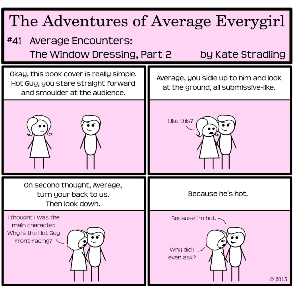
I don’t really know why Average is complaining. With cover trends nowadays, the female protagonist is lucky even to make an appearance. Romance covers in particular are trending toward the “beefy, dynamic man dominates the spread” aesthetic, but the marginalization of women in visual media isn’t exclusive to that particular genre.
It’s almost laughable how often women are portrayed in wistful, submissive, vulnerable states on book covers. Usually, those who do have a “powerful” pose are back-facing, looking over their shoulder at the audience, or else pointedly focusing their intensity off to one side—so as not to confront the reader directly.
Because, you know, that would be bad.
Compare that to the dynamic, aggressive, authoritative stances that men usually take, and the meta-narrative gets pretty depressing. But sexism in the visual arts is nothing new.
And for the romance genre at least, it makes sense to minimize the woman on the cover. She’s not a real character. She’s an avatar for the reader to imprint upon, and the best way to establish that imprint is to ignore her facial features and identifying attributes. Is she blonde or brunette? We can’t tell, because she’s standing in the shadows. Any tattoos? Probably not, but the man can have as many as he wants. That’s hot.
(Do I need to add a sarcasm tag to that last sentence? You know my voice well enough by now, right?)
Vicarious Lives
I suppose we’re meant to live through every protagonist of every book we read. For whatever reason, I’ve always kept a firm fourth wall between myself and any fictional characters. I might love them, but I don’t want to be them. I never claimed Mr. Darcy or Mr. Rochester or any of the dozens of other uncontested literary heartthrobs that so easily climb atop a reader’s idealistic pedestal. Darcy belonged to Elizabeth, Rochester belonged to Jane, and me inserting myself into those equations would have ruined everything.
(Now, whether I wanted to find someone akin to Darcy, Rochester, et al. is another story. But such men don’t exist beyond the pages of literature, because they’re the fantasies of what women want men to be rather than true records of humanity. And we can chalk up my disappointment on that count as yet another reason I’ll die alone.)
Mixed Messaging: dynamic, passive, and everything in between
When the models on a book cover don’t match the character descriptions within the book, I get annoyed. When they’re too obscured to provide any reference for me at all, doubly so. But of course, I don’t even like people on book covers. I’d much rather get my visual cues from the written words within.
And I realize I’m probably in the minority.
Even so, the passive portrayal of women on book covers is something I lament. Show me a woman of intelligence, bravery, steadiness, intensity, and I will gravitate toward that book. I’m tired of reading about passive doormats who are led around from one calamity to the next as they’re acted upon by both the hero and the villain of the story. I certainly don’t want that aesthetic reflected on the cover.